Monday, May 9, 2016

Additional notes for Nordic House

Main and quite long article about Nordic House is here. In this article I mention Catalog page and "Drop a hint" button.

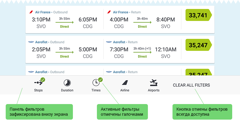
Catalog without prices

I don't know the reason why Catalog page doesn't have prices.
Update: probably, because some items have several options with different prices. In this case it's still possible to show prices: "from £10" instead of "£10".
But I can suggest some advantages of showing prices:
  • A user quickly estimates items. He doesn't need to open Product page to see the product price. It would be very tediously after second-third page opening.
  • This catalog doesn't have filter or sort possibilities. So showing prices is a only opportunity not to open unwanted expensive items.
  • It's possible to compare prices of this website with prices of competitor.
  • A user readily understand that it's a shop and he can buy. It's not just catalog or exhibition.
Current Catalog page without prices
Possible Catalog page with prices

"Drop a hint" button

There is "Drop a hint" button on Product page. This button opens a popup window with 5-fields form.
Current 5-fields form opened via
Would you like to fill in 5 fields?
The problem is any interaction with "Drop a hint" button potentially will be frustrating for user. This button can be misinterpreted as "Add to favorite" ("Save for later") button. But it is about sending a current page link to somebody. It's not often when a user wants to do it, especially using 5-fields form. Usually he wants just to save bookmark for himself.
I think it's better to use "Add to favorite" button, but it's required server. So it's expensive and takes a lot of time. Or also a good option: to remove this button. Nowadays users can use browser's "Bookmark", make screenshots and share links without this "Drop a hint" button.

Related articles

Four new possibilities for Nordic House's users
In this article I am describing 4 new possibilities of obtaining more purchases and more satisfied users.
Nordic House: mockups for tablet and desktop
There are some mockups for tablet and desktop versions.

Monday, May 2, 2016

Four new possibilities for Nordic House's users

"Nordic House" is an online store of Scandinavian style decor for home. There are many interesting products on this website. But users may not even finish checkout due to usability issues.
I am describing 4 problems of this website 4 new possibilities of obtaining more purchases and more satisfied users.
  1. Broken menu button
  2. Tricky basket section
  3. Messy Product page
  4. Inappropriate response to adding to bag

Who has broken the menu button?

The first problem appears on mobile and tablet version. Remember, mobile and tablet traffic is about half of all traffic!
Also "UK adults now spend more time on their mobile devices than traditional desktop PCs for the first time". It means that the first-time experience should be smooth, easy and successful.
But who broken the menu button?
Current version

Thursday, April 28, 2016

Friday, October 16, 2015

Фильтры на примере Skyscanner и Aviasales

Skyscanner and Aviasales logos
В этой статье я рассматриваю удобные и правильные решения для фильтров на примере приложений Skyscanner и Aviasales. Приложения предназначены для поиска авиабилетов. Я запускаю их на планшете.
Фильтры Skyscanner реализованы правильно с точки зрения юзабилити, а фильтры Aviasales содержат недоработки.

Skyscanner

Базовые вопросы о фильтрах, на мой взгляд, следующие:
  • Панель фильтров легко или всегда доступна?
  • Текущее состояние фильтров отображено на экране?
  • В любой момент можно отменить фильтры?
В Skyscanner ответ на эти вопросы «Да».
  • Да, панель фильтров отображается внизу экрана
  • Да, активные фильтры отмечены галочками
  • Да, кнопка отмены фильтров находится рядом на панели.
Панель фильтров в Skyscanner

Monday, October 12, 2015

Список авиабилетов в Skyscanner и Aviasales

Skyscanner and Aviasales logos
Приложения Skyscanner и Aviasales нужны для поиска авиабилетов, отелей и проката машин. В этой статье я рассматриваю экран со списком авиабилетов.
Список авиабилетов и рейсов – это основной рабочий экран.
Чтобы быстро и легко принять решение о правильном рейсе, нужно чтобы:
  • Информация была понятной, не вызывала недопонимания или сомнения.
  • Информация была выделена в соответствии с важностью: сначала важное, потом детали.
  • Информации не было слишком много за раз.

Monday, October 5, 2015

Эмоции против простоты и эффективности

Skyscanner and Aviasales logos
В этой статье я описываю, какие впечатления можно получить в первые 2 минуты работы со Skyscanner и Aviasales. Это приложения по поиску авибилетов, отелей и аренды машин.
Забегая вперед, приложение Skyscanner проще и функциональнее, быстрее показывает результаты, но не является победителем сегодняшней статьи. Приложение Aviasales выгодно отличается от Skyscanner тем, что вызывает эмоции и превращает поиск билетов в приятное занятие.
Забегая еще дальше, следущие 10 минут намного приятнее и эффективнее со Skyscanner. Об этом в этой статье.

Начальный экран

Форма Skyscannner имеет лаконичный, но выразительный дизайн, за счет контраста в цвете и начертании шрифтов. Она воздушная и легкая, при этом не часто используемые опции спрятаны. К этому я добавлю только один недостаток.
Недостаток: Легко перепутать, какая вкладка активна – ONE WAY или ROUNDTRIP. Пользователь думает: «Обычно активна первая вкладка. К тому же вторая вкладка отделена от контента жирной чертой. Значит, сейчас я во вкладке ONE WAY... С другой стороны, заголовки на форме голубого цвета, значит голубой цвет означает активную вкладку». И пользователь запутался!
Форма Aviasales... экран Aviasales отличается от Skyscanner.
Экран выбора параметров рейса Skyscanner
Экран выбора параметров рейса Aviasales
Экран Aviasales завладел вниманием пользователя. Пользователь забыл, например, о том, что он на работе, или о том, что у него на кухне молоко убегает. Это сильное качество приложения – увлекать, погружать.

Friday, September 18, 2015

Addition to the previous article

ES application logo
While I was translating the article about ES File Explorer, ES Global developers released a new 4.0.0.2 version!
It's really good that they improve and support the application!
A new version of ES File Explorer looks more modern and uses "Material Design".
My suggestions are about UI elements and Main Menu structure, not about visual design. So these suggestions can be used both in an old and a new version.
A new version 4.0.0.2 and my version:
Path panel
Path panel
These screenshots has been made on a smartphone while in previous article I used tablet.

What ES File Explorer could look like

Developer: ES APP Group
See app: on the Google Play
App version: 3.2.5.5
Installed: on Android tablet
ES application logo
ES File Explorer is a very popular Android file manager. The application has 4.5/5 rating from over 1.6 million reviews.
The application is free and has many features.
Although being very popular, the application has two unusual solutions which are likely to be difficult for new users. These solutions were developed for small screens some years ago. Nowadays these solutions are not really suitable for big smartphone and tablet screens and these solutions are still difficult for new users.
The two unusual solutions are two panels: the location panel [1] and the top panel with icons [2]. I will also pay attention to menu structure as it is an important part of any file manager application.
Changes of the interface
Existing users complain about interface, for example they wrote on the Google Play: "add fresh UI…", "it could have a better interface on tablets", "i've been using this app since 2010 and i love it. but i'm bored with its 2010 UI. Please update to the more modern look. the features are already better just the UI is so old", "It looks so antiquated when compared to more recent file managers", "Great app, but there is a learning curve", "It is not attractive at but does it's job well".
Although my suggestions presented in this article are about usability, they can also increase UI "freshness".
All the screenshots found in this article have been made on an Android tablet.

The location panel

Location panel elements perform five actions:
  1. Open Main Menu
  2. Go to a parent folder
  3. Show current location (current folder)
  4. Open History
  5. Close current folder.
Path panel
Problem
It is difficult for a user to understand the main purpose of the panel and which elements are important. That is because he sees many elements and some of them are unusual (the icon ">" is too far from the text; there is a "lonely" triangular icon).
Solution
In the application the user already can open several folders simultaneously in the different tabs. I suggest keeping on the panel only elements which are directly connected with the current folder. Main Menu and History buttons are not related to the current folder.
At the moment it's not obvious how to open History. The user is unlikely to decide to open History by touching the current folder name or the small triangular icon, and if he does so he would rather be surprised (confused).
I also suggest showing the "Back" button instead of parent folder name. It is not important for most users to know a parent folder name. They don't remember file system structure of Android OS. If a user don't find a file on the current level of file system hierarchy, he will likely just go back or will begin searching from another folder. Replacement of parent folder name by the "Back" button doesn't reduce application functionality, but it improves readability of a current folder name.
Action plan:
  • Remove the triangular icon
  • Move the menu icon to the top panel
  • Move History to the action overflow menu
  • Replace parent folder name with the "Back" button.
Action overflow menu contains several items: History, Settings and Quick settings (located in the Tools menu). To open this menu the user should touch "Three vertical dots" button in the top right corner.
Action overflow menu
Sometimes users would like to see a full path name, for example, when they browse system folders. So I would add quick setting "Show full path name: Yes / No". By default this setting would be set to "No". By the way, I talk about the full path name, not about parent folder name only.
Full path viewing version
Current and my version of the location panel (pictures are clickable):
Current version of the path panel
Current version of the location panel
My version of the path panel
My version of the location panel