Website: www.nordichouse.co.uk
"Nordic House" is an online store of Scandinavian style decor for home.
There are many interesting products on this website. But users may not even finish checkout due to usability issues.
I am describing 4 problems of this website 4 new possibilities of obtaining more purchases and more satisfied users.
- Broken menu button
- Tricky basket section
- Messy Product page
- Inappropriate response to adding to bag
Who has broken the menu button?
The first problem appears on mobile and tablet version. Remember, mobile and tablet traffic is about half of all traffic!
Also "UK adults now spend more time on their mobile devices than traditional desktop PCs for the first time". It means that the first-time experience should be smooth, easy and successful.
But who broken the menu button?
Also "UK adults now spend more time on their mobile devices than traditional desktop PCs for the first time". It means that the first-time experience should be smooth, easy and successful.
But who broken the menu button?

Users expect that there is the left top button and it opens Catalog menu. It is but it opens another, not very useful menu.
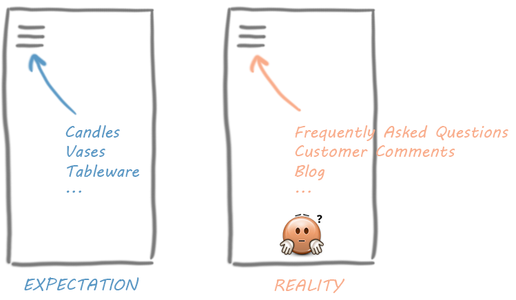
These websites have the top left button that opens Catalog menu. These websites generate user's expectations.

So, the problem is:
 Top left button opens unexpected menu which doesn't help to reach user's goal (find-buy items).
- The button which opens Products Category Menu is placed in the middle of the screen, what is unexpected.
- The buttons are hardly visible on the background.
- It's confusing to place two identical buttons on one page.
There are current version and my solution:

Advantages of my version:
 Users readily search items via Catalog menu (top left button).
- Website looks more modern and reliable.
Links of another menu (FAQ, Press, Blog, Contacts etc.) are placed at the footer of the website. So it doesn't matter who has broken menu. The point is to fix it.
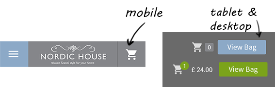
You can notice that basket section has been changed completely. I'm just going to tell about it.
Tricky basket section
Do you know the difference between "Shopping bag" and "Checkout"? Remember your previous experience with other websites. The answer is there is no difference.
Because "Checkout" can't perform without "viewing Shopping bag". Both buttons open the same page in most cases.
Yes, sometimes users are annoyed the slow process of checkout. Because they see "list of items in the bag" and then "checkout" page. But if users don't see "list of items in the bag" before "checkout" they definitely will worry about it and decide to check again the bag.
Yes, sometimes users are annoyed the slow process of checkout. Because they see "list of items in the bag" and then "checkout" page. But if users don't see "list of items in the bag" before "checkout" they definitely will worry about it and decide to check again the bag.

The problem is that after clicking on the "Checkout" link user get a page containing just a form with personal details (Name, e-mail, address). The user misses list of items in the bag. Most likely the user intuitively clicks "Back" button, doesn't see list of items and getting confused (frustated). It's critical for those users who confuses "Checkout" with "Shopping Bag" link. They will not be able (or be willing) to finish checking out their items.
The solution is I am using only one button – "View Bag" instead of two buttons "Shopping Bag" and "Checkout". For mobile "View Bag" looks like just a basket icon. For tablet and desktop it's a button with text.
Advantages of my version:
- Users readily understand which button is for checkout process.
- It's more obvious when the basket is not empty.
- Website looks more modern and reliable.
Messy Product page
The problem is there are too many blocks on Product page. There is no significant action button. There are unused elements on this page. Product page generates messy thoughts like "Description, er.. description, is it another description?.. button, price, prices, er.. one picture but four prices, button.. need to choose between buttons".
My solution is to join text blocks about item; make "Add to bag" button more noticeable and replace it; hide prices for related products; hide social buttons.
Current Product page looks like:

Advantages of my version:
- Even non English-speaking user can understand meaning of all sections (price, button, description, additional links).
- It's easier to find and click on "Add to bag" button.
- It's good for mobile version.

I want to explain points about related products and social buttons.
A user sees prices for 4 products on the screenshot below. He can buy 4 products together (main product and related products). My opinion is the user won't buy products simultaneously. He doesn't see product picture and description. He probably goes to related product's page to read additional information. I assume just few users will buy related products simultaneously. Most of users probably think: "Why do they show me this information.. additional prices.. It's so distracting! Why do I must see Candle Adhesive is "in stock"? I don't care about Adhesive!"
It's absolutely right to offer the user links on related products. But to place links is enough for this page.
There are social buttons near "Add to bag" button. These buttons are not connected with current item, they are about brand in general. It is the same as to add "About us" link to every Product page. Product page is designed to describe certain item, not the brand. These buttons should be placed outside product section, for example at the footer.
"Pin" button is only button connected with current item. But before keeping this button I would prefer to know how many users click on this button and if the button help to business (increase revenue). Now I'm not sure this button makes difference so I hide it. Google Analytics can help to estimate utility of "Pin" button.
Inappropriate response to adding to bag
I want to mention a confirmation to adding to bag. The problem is inappropriate response to adding to bag. Current text message looks like an error message because of red color.
Advantages of my version:
- Clear and kindly confirmation of adding to bag.
- A user sees next action that helps him to finish purchase.

Current message (left). My informative message (right)
Related articles

Nordic House: mockups for tablet and desktop
There are some mockups for tablet and desktop versions.

Good thing, this online store has become more friendly for users (with my help too)!
ReplyDelete- Menu button is working
- Product page is clear (a big "Add to bag" button and price before description section)
- After adding an item to bag users are shown a Basket page - good solution