Developer: ES APP Group
See app: on the Google Play
App version: 3.2.5.5
Installed: on Android tablet
See app: on the Google Play
App version: 3.2.5.5
Installed: on Android tablet
ES File Explorer is a very popular Android file manager. The application has 4.5/5 rating from over 1.6 million reviews.
The application is free and has many features.
The application is free and has many features.
Although being very popular, the application has two unusual solutions which are likely to be difficult for new users. These solutions were developed for small screens some years ago. Nowadays these solutions are not really suitable for big smartphone and tablet screens and these solutions are still difficult for new users.
The two unusual solutions are two panels: the location panel [1] and the top panel with icons [2]. I will also pay attention to menu structure as it is an important part of any file manager application.

Existing users complain about interface, for example they wrote on the Google Play: "add fresh UI…", "it could have a better interface on tablets", "i've been using this app since 2010 and i love it. but i'm bored with its 2010 UI. Please update to the more modern look. the features are already better just the UI is so old", "It looks so antiquated when compared to more recent file managers", "Great app, but there is a learning curve", "It is not attractive at but does it's job well".
Although my suggestions presented in this article are about usability, they can also increase UI "freshness".
All the screenshots found in this article have been made on an Android tablet.
All the screenshots found in this article have been made on an Android tablet.
The location panel
Location panel elements perform five actions:
- Open Main Menu
- Go to a parent folder
- Show current location (current folder)
- Open History
- Close current folder.

Problem
It is difficult for a user to understand the main purpose of the panel and which elements are important. That is because he sees many elements and some of them are unusual (the icon ">" is too far from the text; there is a "lonely" triangular icon).
Solution
In the application the user already can open several folders simultaneously in the different tabs. I suggest keeping on the panel only elements which are directly connected with the current folder. Main Menu and History buttons are not related to the current folder.
At the moment it's not obvious how to open History. The user is unlikely to decide to open History by touching the current folder name or the small triangular icon, and if he does so he would rather be surprised (confused).
I also suggest showing the "Back" button instead of parent folder name. It is not important for most users to know a parent folder name. They don't remember file system structure of Android OS. If a user don't find a file on the current level of file system hierarchy, he will likely just go back or will begin searching from another folder. Replacement of parent folder name by the "Back" button doesn't reduce application functionality, but it improves readability of a current folder name.
Action plan:
- Remove the triangular icon
- Move the menu icon to the top panel
- Move History to the action overflow menu
- Replace parent folder name with the "Back" button.
Action overflow menu contains several items: History, Settings and Quick settings (located in the Tools menu). To open this menu the user should touch "Three vertical dots" button in the top right corner.

Sometimes users would like to see a full path name, for example, when they browse system folders. So I would add quick setting "Show full path name: Yes / No". By default this setting would be set to "No". By the way, I talk about the full path name, not about parent folder name only.

Full path viewing version
Current and my version of the location panel (pictures are clickable):

Current version of the location panel

My version of the location panel
The top panel with icons
In the application the user can open several folders simultaneously in different tabs. Every tab is shown as an icon on the top panel. An active tab also has a text name to the right of the icon. When user open the application for the first time there are three tabs: "Homepage", "Local" and "Network". Accordingly, the user sees three icons on the panel.

Active "Local" tab
It is unusual approach for mobile file managers to have multiple tabs.
Advantages of using several tabs in ES File Explorer:
 It is easy to switch between two tabs; that allows users to move and copy files quickly. In the case of single tab the user has to move up and down the file system hierarchy to switch between "source" and "destination" folders.
- It allows creating a set of frequently used tabs (i.e. folders) for quick and easy access.
Problems of using multiple tabs:
 When there are too many tabs it is difficult to navigate through them. Tabs in the application are being created automatically and the user has to prevent tabs from piling up. He has to manually close unnecessary tabs every now and then.
Tabs are shown as small icons. This idea has both benefits and disadvantages.
- Icons take up little space on the screen and so it is easy to display many tabs without scrolling.
- Advanced users may recognize icons faster than text.
- Many users are not familiar with representation of tabs as icons, they may not understand what icons are for.
- It is not possible to know which folders are open by watching at tab icons. Icons are ambiguous and don't carry folder name information. Text is easier to understand and is more informative.
- The user may have problems navigating through tabs. If the user don't notice that he can use "swipe" gesture to switch between tabs, he has to touch small icons which is not easy.
Tabs can be made easier to understand. This can be achieved by changing tabs presentation and changing the way tabs are created.
Tabs as folder names
I suggest replacing tab icons with folder names. I believe that more users will recognize folder names as tabs, it is more common way of representing this UI element. Users will also get more information from the tabs panel because they will always see names of open folders. You can see my mock-up of tabs as horizontal text entries on the picture bellow.

If there are too many tabs and they don't fit into one screen, they will be scrolled.
Changing the way tabs are created
It doesn't matter if tabs are shown as icons or as text, the problem of tabs pilling up remains unsolved.
In the current version every time user touches a Main Menu item a new tab is created.
I propose to stop doing it and let the user decide when to create a new tab.
I propose that initially there is only one tab that can not be closed (if there is one tab only). If the user touches "+ New tab" button, a new tab will be created. That tab can, for example, show same folder as previous active tab. After the new tab is created the user can move up and down the file system hierarchy or select another menu category to navigate to target location. When the tab is not required anymore it can be closed.
Initially there is only one tab that can not be closed

Two tabs (Home and Android)
It is an open question what to show when a new tab is created. It is possible to show Homepage or copy of a current tab.
In version with manual tab creation it is still easy to copy and move files between different tabs but tabs do not pile up. Those users who don't need multiple tabs will not be forced to close auto generated tabs.
In the current version of ES File Explorer tabs are named by the name of Main Menu category or subcategory. When the user browses folders from single category all tabs have same name and icon which is absolutely uninformative:

In my version I suggest naming tabs by represented folder name, not by category name. Thus the user can see names of opened folders on tabs panel, like "backup" and "Android", but not "Local" and "Local".
On a picture bellow Menu Icon is located on a separate panel. It could seem wasteful to spend whole line for one button. But in this case I think it is better to sacrifice screen space rather than mix up tab controls and unrelated Menu Icon. Bellow I will suggest yet another version where menu icon won't require an additional line.
Current and my version of tabs:
Current version of tabs as icons

My version of tabs as text
Menu structure
Problem of Home tab
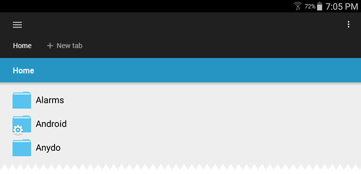
The first screen which user sees when he launches the application for the first time is a Home tab. "Home" is a name of this location in Main Menu. This location contains folders which the user sees when he connects an Android device to a computer, like "Alarms", "Android" and "DCIM".
But when the Home location is shown in one of the tabs, there is no "Home" word anywhere on the screen. The user just sees mysterious "sdcard", "Local" and "/". "Local" and "/" do not associate with anything for most users, what's worse the "sdcard" word can be misinterpreted as "memory card".

"Local", "/" and "sdcard" words on the Home screen
For other locations like "Movies" or "FTP" tab title matches menu item name.
"Home" location has a parent folder displayed as "/". If the user touches "/" button, he will be navigated to the root system directory. Also the user can navigate to the same location by selecting "Device" in Main Menu. I think the possibility of easy (accidental) jump to the system level from Home tab is a problem.
Solution
I suggest moving the system level from category "Local" to a separate Main Menu category. Creating a special distinct "System" category will prevent those users who don't intend to operate with system files from accidental mistake. With "System" not being in the same category as "Home", "Home" will become a top level in the "Local" file system hierarchy and it will not have a parent folder ("/") anymore. Home tab can be renamed to "Home", "Tablet", "Internal storage", or "Internal memory".
Current and my version of Home tab (without other changes already proposed above):
Current version of Home tab

My version of Home tab

Current version of Local category in Main Menu

My version of Local category in Main Menu
Hierarchy change: improvement structure of Local category
Though "Local" locations are displayed as a plain list, logically they relates to each other as tree nodes. The user can get lost in this hierarchy as in a labyrinth.
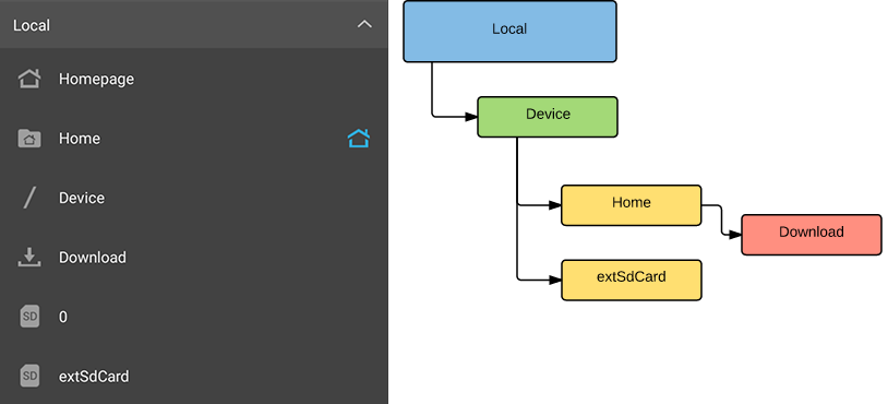
As I have written above, I suggest moving subcategory Device from Local category to a top level of Main Menu. After this and some minor changes described bellow there will remain only two independent subcategory in Local.
List of "Local" hierarchy changes:
- Move "Homepage" to the top level of Main Menu or even remove it.
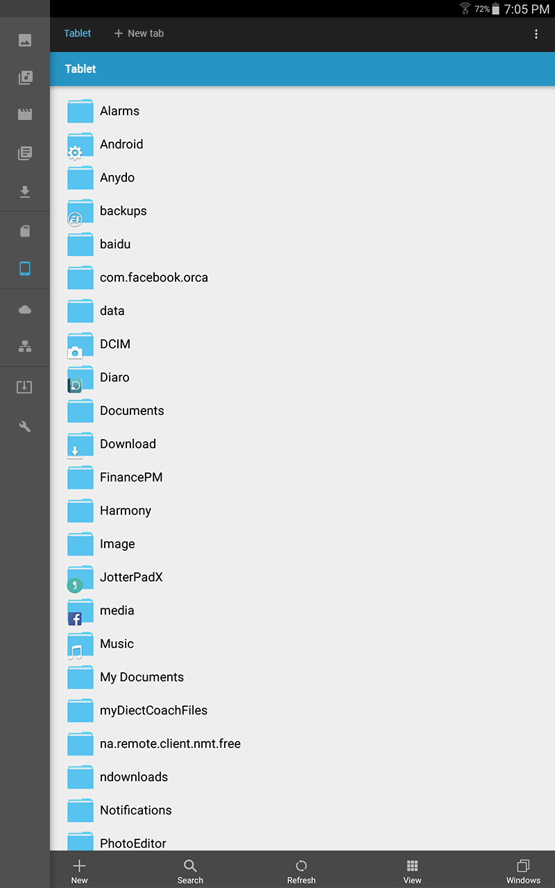
- Rename "Home" to "Tablet" (or "Phone" - if the device is a smartphone).
- Move "Device" to the top level of the Main Menu and rename it to "System".
- Move "Download" to "Library" (where all categorized files are located).
- Remove "0" subcategory.
- Rename "extSdCard" to "SD card".
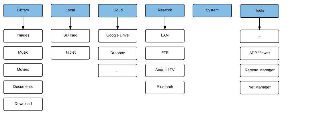
There will remain only two independent subcategory in Local:

Main Menu structure after "Local" category changes:

Hierarchy change: improvement of other categories
As I've already started changing "Local" category structure, it would be logical to improve other categories as well.
- Remove "Favorite" category (or keep it only on the Homepage). Favorite contains user managed web site links. It seems to me that an ability to open web sites from ES File Explorer is unnecessary feature. Users have a special browser application for that. ES File Explorer is designed, in the first place, to search or do other actions with files.
- There is a subcategory in the Network category with exactly same name "Network"! This subcategory displays active connections from all network subcategories (LAN, Cloud, FTP and others). I think in the current version Network subcategory is unnecessary, because the list of connections is already shown in the Main Menu, thus this category is duplication of functionality. Although I suggest adding count of active connections for every network subcategory which are currently missing in the Main Menu.
- Move "APP (Applications)" to "Tools". Actions with applications differ from actions with files, so it will be logical to have "APP" as tool, rather than as a location. Again, as with Favorites, I, personally don't think that file browser should help dealing with applications at all.
- Move "Cloud" to the top level of the Main Menu. An ability to connect cloud storage, for example, Google Drive or Dropbox, is popular among many users. It is easy to setup it in contrast with, let say FTP. Users are more likely to recognize availability of cloud services when these have a separate category in the Main Menu.

Order of categories in the Main Menu should correspondent with frequency of category usage. On the picture below you can see proposed order of categories.
I have moved "Library" to the first place. Judging by myself and few friends I've talked to, mobile users don't think in terms of Android OS file structure or in terms of which folder their files are located in. It is easier for them to access files by type (images, music, video). "SD card" is more important than "Tablet", because users often use a memory card. They often download files from computer to memory card instead of internal memory because internal memory is limited and has a complicated folder structure. Thus users are familiar with folder structure of memory card.
"Tools" can be located in the Action overflow menu (with "History" and "Settings"), because they are not a location.
Main Menu structure after improvement of all categories:
Permanent Main Menu panel
In the current version of application Main Menu is opened by default in the horizontal orientation. It is convenient because it allows the user to navigate between categories quickly. Also Main Menu shows the user which options are available to him. In the vertical orientation however Main Menu is hidden.
Problem
In the vertical orientation the user can't see a suitable navigation panel. Thus he may not notice all navigation options. For example, he may not use Library to browse by file types and thus will not use application to it's full power. Without permanent Main Menu the user tends to remain in the current category and try to find his files by navigating up and down a file system.
Solution
I suggest adding a permanent panel with location icons. The panel can be expanded to a full Main Menu by swipe gesture. At the same time I suggest the most fundamental change of the Menu structure. It is getting rid of hierarchy.
- Permanent panel can show current user location by highlighting corresponding icon.
- The user sees all available categories at once. He doesn't need to remember that "Images" is located in "Library" or that "SD card" is in "Local".
- The user doesn't need to open category to see subcategories. He even doesn't need to expand menu as soon as he memorizes icon meaning. Selecting a category and switching between categories will become quick and easy, in "one touch".
- The user will see more categories at once.
Panel with menu icons
Opened Main Menu in the current version and in my version:

Opened Main Menu in the current version

Opened Main Menu in my version
There is only one icon for all network locations in my version of the panel. Thus all active connections will be shown in the content area when "Network" is selected.
Current and my version of Network tab:

Current version of Network tab

My version of Network tab
To summarize
Many users complain about outdated or confusing interface of ES File Explorer.
I suggest changing main elements of the interface: tabs (representation and creation) and the location (path) panel. I also suggest two versions of what Main Menu could look like: with improved hierarchy and without hierarchy at all. Besides that I suggest making Main Menu panel to be permanent but collapsible to just a set of icons.
I do not pretend that all my ideas are right and perfect but I hope my ideas will be helpful for developers and will be a good food for thought.
Behind my research there is the interest to the application and the desire to see more usable and clear ES File Explorer.
Also I wrote a small addition about new version of ES File Explorer.
No comments:
Post a Comment