I wrote these recommendations based on 8 users interview and my opinion. Recommendations are for Android tablet version. I am myself have been using Diaro for 8 months and I really like it! Others were first time users. Their age: 26-30 (6 users) and 45-50 (2 users). All of them regularly use tablets.
The article is about how to help new users get a good Diaro experience.
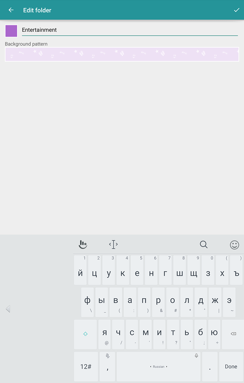
Folder editing
Problems: Users expect that tapping on back arrow will save folder settings, but it doesn't. Folder color picking is difficult.
Recommendations:
- Save changes by "Back" button, remove "OK" button. Currently users don't notice "OK" button (5 of 8 users). Most likely it is because all controls in this view are located on the left while "OK" button is in the right corner. 2 users explained that "Back" button saves changes on the note editing screen so they expected same behavior here.
- Add a "Color line" near the Folder name to show the user meaning of the color. Change color of the line when the user picks the color on the palette.
- Add a palette of harmonious colors instead of Color picker. Hide colors already used for other Folders so that the user don't get folders with the same color. Automatically assign new color to new folders. It's easier and more quickly way of color selection.
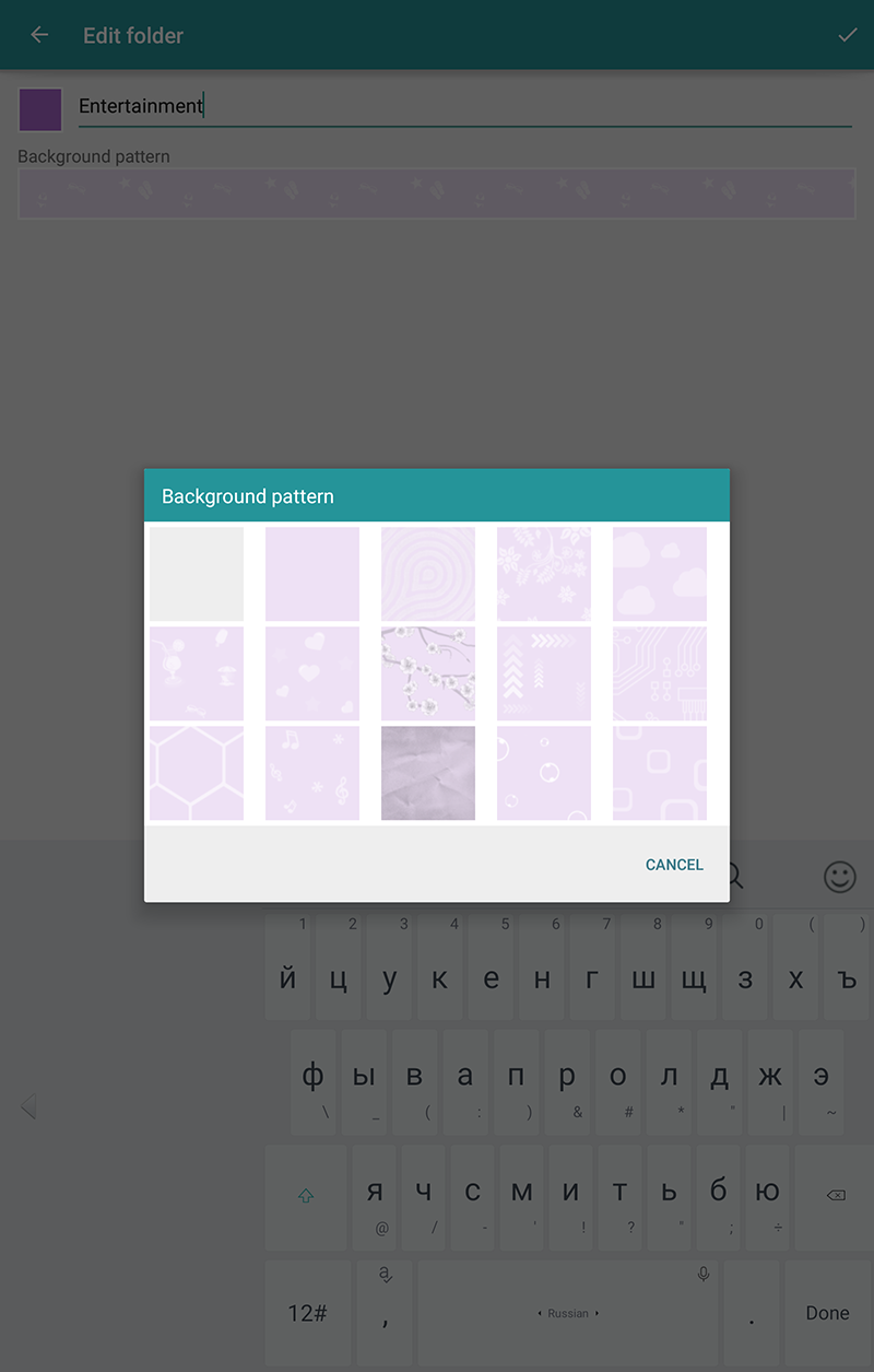
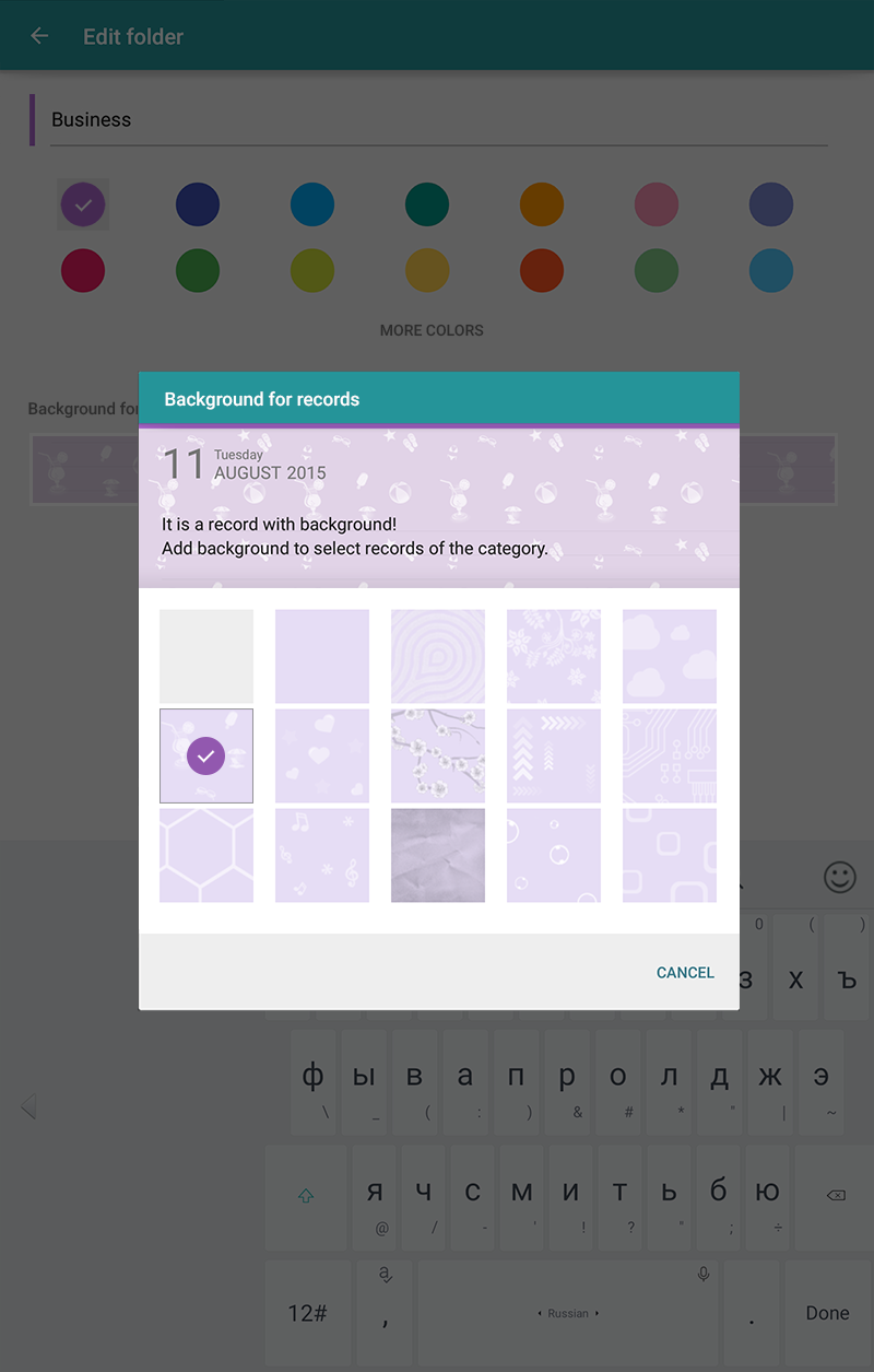
- Add a "real" example of background usage. Currently users (4 of 4 who taps on the Background) can't understand what is a "Background" for Folder.
Current folder editing

My version
Current Background layer
My version
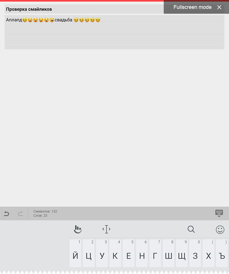
Note editing
Users make non critical mistakes but these mistakes slow down notes writing.
At the moment when the user taps on the "Fullscreen" button he don't understand what happened and how to come back. I explain it by the fact that "Fullscreen open" button and "Fullscreen close" button appear in different parts of the screen.
3 of 8 users noticed that "OK" button saved and closed the record. But when they were editing existing record, "OK" button didn't close a record (only hid the keyboard). Users didn't understand this behavior.
3 of 8 users misinterpret "Undo" arrow with "Back" arrow.
Recommendations:
- Add a hint about "Fullscreen mode" with "Exit" button.
- Replace "OK" button with "Hide keyboard" button.
- Change the bottom panel color. Currently the color is similar to keyboard background color. Thus users don't think that the bottom panel is a part of the application.
Current note editing
My version
Record preview
Problem: record preview is overloaded with meta information.
Recommendations:
- Remove extra text on record preview when filter applied. For example, when folder filter is applied, all records have the same folder name.
- Hint users that they can assign a short title to location. Short names will make location information compact and easy to read.
Locations are added automatically to every record. Since this happens without user will, the user often don't know that he can assign a name to a location. When first location is being added, a tip can be shown (like You can edit location and assign a short name to it as "Home" or "Work"). The tip can be removed after first location name is created.
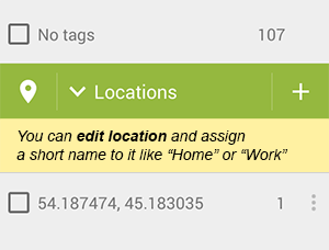
Example of the tip
Filters
I have found some problems related with Filters.
The first problem: users don't know how to remove enabled filter by date or folder (2 of 8 users).
Recommendation:
- Add the option "All folders" to Folder list.
In this application there are 5 ways to remove filters. Maybe it indicates that application is flexible and powerful. Maybe it indicates that there is no one good solution for all users. Users don't notice Folders icon change (5 of 8). Only 2 users try to tap again on the folder name. By the way I think it is not a common solution ("tap again"). Folders have "radio button-like" behavior, tags have "checkbox-like" behavior. "Tap again" is used for checkbox behavior. So I suggest to replace "Remove filter concept" with "All items filter option".
Second problem: users misinterpret "Pen" icon on the top panel as "Edit" button (7 out of 8). It is not a critical problem, but it is very common and easy to fix (I think).
Recommendation:
- Remove "Pen" icon and add record counter to the filter name.
I think this misunderstanding is due to "Pen" icon is located near "Close" button and looks like the button. So users think "Oh, it is a button".
Also removing "Pen" icon help to solve next problem. The problem: users don't understand what exactly they will close (or remove) tapping on the "Close" button on the filter panel. I explain it by the fact that "Pen" icon breaks connection between Filter name and "Close" button.
Proposal for discussion:
- Remove Home" icon and replace "Settings" icon to the right.
Current filter

My version
Developers have changed Folder color picking as I suggested!
ReplyDelete