
It's a translation from Russian. Оригинальная статья здесь.
The first problem: the calendar (the centerpiece UI element) has limited functionality
When creating an note application you can go several ways.
First way is to show notes are a flat list which displays new notes at the top.
First way is to show notes are a flat list which displays new notes at the top.
Second way is to show every note for a specific day on the calendar. Such applications are used by people whose work is closely connected with time and meetings planning. Or by people, keeping a diary.
Note list is an application, which is following second way.
It contains following ideas:
It contains following ideas:
- The calendar. In the vertical orientation it is very large and takes more than a half of the screen! In the horizontal orientation it is on a central place.
- Each note is linked to a specific date ("calendar date"). "Calendar date" can be changed, that is a note can be moved to another date in the calendar. Additionally any note has two different dates: a calendar date and a date of note editing.
But although the idea of calendar is used in the application, the Note list calendar is not as informative as it could have been.
All that you can see on the calendar is presence or absence of notes on a specific date.
All that you can see on the calendar is presence or absence of notes on a specific date.
What else could have been shown on the calendar:
- How many notes are linked to a specific date
- A folder (category) of a note
- Note priority
In this case, the calendar will be useful and will take a central place in notes navigation. The calendar must be suitable to browse through day of weeks, months, etc. But in the current version of the calendar there are a few problems with that, for example:"Today"is not highlighted when there are some notes for today, weekends are never highlighted. There are other problems with calendar browsing which I will not mention here.
In the horizontal orientation the calendar is smaller than in vertical. It is more logical because less information an element provides, less space is taken. But developers need to decide whether their users need the "calendar" approach, and if "Yes", then enhance the calendar.
The second problem: the note closing
In a suitable application users don't notice the moment of note closing. After all it's not the most critical action for them. It's more important, for example, to write a new note or find an existing note.
But in Note list closing moment is emphasized and the user permanently has to choose between two buttons to close a note.
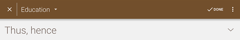
The top panel with "Х" and "Done" buttons
The user need to select the right ("Done") button to close note. But there is a strong possibility that a user selects the left ("X") button because that button is located in the standard place and is similar to "Close" button.
In this case user risks exiting without saving by mistake (that is critical!) or he has to read the dialogue box, close it, feel, that he has done something wrong and after that try another button.

The dialogue box that is shown by clicking "X" button
Thus the «X» button:
- Slows down the process of work
- May lead to data loss error
- Makes the user feel stupid
The button gives more disadvantages. Possible solution is to remove the "X" button and add automatic saving, so only one "Back/Done" button stays. Note closing will be quick and safe.
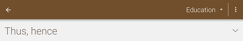
My version with one button on the left
If it turns out that users really wish the "Exit without saving" functionality, that functionality can be implemented in another way, for example, using the "Undo" button.
The problem with note closing is relevant for all users, both for newcomers and advanced users as well.
The third problem: changing a folder name
You need to press on a folder name to open context menu with "Rename" and "Delete" actions. Not all users know about it. It's enough to add context menu icon to make this action more obvious, for example as in the Diaro application.
Context menu icon (three points) on the right picture (Diaro application)
This problem exists for users, who don't know all kinds of taps and gestures and who don't tend to explore the interface.
The fourth problem: an unclear step to start note editing
To start note editing you need to press "Edit" button, clicking on the text is not enough.
Disadvantage of this design is that you have to find and press "Edit" button. In additional, the user is losing focus of attention. Supposing that you are viewing a note and decide to add a comment in the third paragraph. After that you have to come back to the top to press "Edit" button and find the right paragraph again.
"Edit" button located at the top right near the title
"Edit" button should be changed to become more noticeable. For example, to draw the button in Material Design style, since this style has already been partially applied in the application. Better option is to allow editing by clicking on the text. So that the user can click on that paragraph he wants to edit.
The fifth problem: text color selection is difficult
The application is free. But you can buy a Pro-version to have some additional features, for example text format.
In the current version of the application color selection is uncomfortable. I mean "Text color" and "Highlighting" format options here.
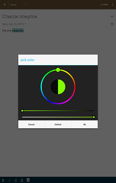
Color is selected by using the color picker
Color is selected by using the color picker, there are no set of standard colors (color palette). It causes several problems.
Firstly, it's difficult to select a color. Not all people know how to use color picker, how to change sliders of saturation and brightness. It's more easier and faster to select color from colors of the color palette.
Second, it's impossible to select same color while text formatting. Red text through entire note will be in different tints of red. That looks untidy. Besides, a pre-designed color palette promotes harmonious style because it uses harmonious colors.
Minor flaws in the interface
The application also has minor flaws in the interface. Each of them isn't very important separately, but together they create a negative impression of an unfinished product.
Same icon is assigned to "New note" and "Edit note" buttons. This may confuse users. It's better to use a standard icon "+" for note creation.
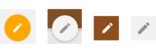
The first button is "New note", others are "Edit note"
In the Recent note list every note contains two dates. You need to spend a little time to understand that one date is "a calendar date", which is linked to a calendar and another date is a date of last note editing. It is possible to create separators "Changed now", "Changed last week" in the note list instead of displaying the date of the last changes on every note.
Empty notes saving is a questionable solution
The application has the ability to save an empty note without a title and content. It makes no sense. Such notes are displayed, as well as other notes in the note list and in the calendar. They spend place on the screen and clutter the interface.
The main reason why the user saves an empty note is by mistake. The user wants to go back to the calendar or the note list and presses "Done" button. The application should not save such notes at all.
No comments:
Post a Comment